Getting paid
Reports & Expenses
Reports
The Reports page defaults to the current month, with quick presets for This Month, Year to Date, and Current Year, plus a date-range picker and an optional single-employee filter. It shows:
- KPI tiles for revenue, expenses (with % of revenue), profit (with margin %), and tax collected
- Job counts by workflow stage, linking into a filtered Jobs list
- Outstanding invoices
- Estimate conversion rate (approved ÷ decided)
- Your top 5 customers by revenue
- Job-level profitability, ranked (revenue minus materials minus expenses, per job)
- Technician performance, with a link to the full technician performance page
- Month-over-month revenue and new-customer growth
How profit is calculated
Everywhere the platform shows profit — on a single job, on the Dashboard, or on Reports — it uses the same formula: revenue (amount actually paid on linked invoices) minus the cost of materials used (at the price recorded when they were used) minus logged expenses. Reports additionally folds in standalone business expenses (see below), which don't apply at the individual job level.
Expenses
The Expenses page (under Reports) combines two sources: expenses logged against a specific job (managed from that job's own page) and standalone business expenses — things like rent, utilities, insurance, or supplies that aren't tied to one job — which you add directly here with a description, category, amount, and date. Only standalone business expenses can be deleted from this page; job expenses are managed from the job itself.
The page shows total spending, a breakdown by employee, and your top expense items by description — the last two ranked against the biggest, so who or what accounts for most of the total is a length rather than a sum done in your head.
Custom reports
The custom report builder is for the questions the fixed reports do not ask. You pick a source, choose which of its columns to show, set a date range, optionally group and total — then save it, so it is one click next time rather than rebuilt.
| Source | Reports on |
|---|---|
| Jobs | Work: stage, schedule, assignment, customer. |
| Customers | Your customer list and when they joined. |
| Estimates | Quotes and what happened to them. |
| Invoices | Billing, totals and payment status. |
| Job expenses | Costs logged against a specific job. |
| Business expenses | Overheads, with a category to group by. |
| Purchase orders | What you ordered from which supplier. |
| Materials | Your material catalogue and stock. |
| Equipment service due | Customer equipment with its next service date, worked out from the service log. |
| Subcontractors | Outside trades and their details. |
Worth knowing
What this does not do
Sending a report on a schedule
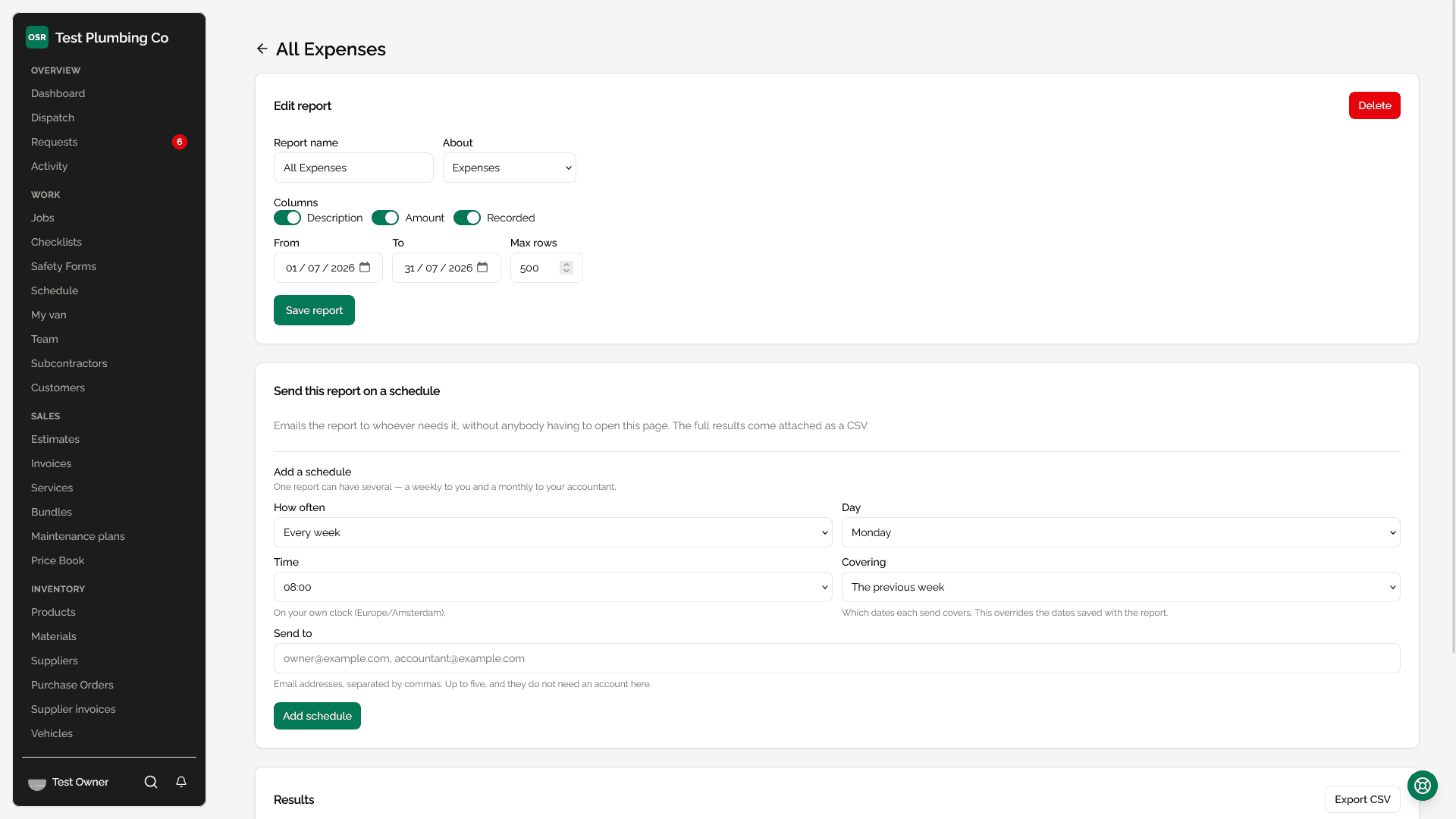
A saved report can email itself. Set how often it goes, at what time, and who receives it — and it arrives without anybody opening the page. The covering email carries the figures worth glancing at, with the full results attached as a CSV and a link back to the version you can sort and regroup.
One report can carry several schedules, because they are often different jobs: a weekly to you and a monthly to your accountant, from the same saved report.
| Setting | What it does |
|---|---|
| How often | Daily, weekly on a chosen day, or monthly on a chosen date. |
| Time | Read on your own clock, not ours. Eight in the morning means eight where you are. |
| Covering | Which dates each send covers — the previous day, week or month, the month so far, or the fixed dates saved with the report. This overrides the report's own dates, which is what makes a weekly report say something new each week. |
| Send to | Up to five email addresses. They do not need an account here, which is the point — your accountant can receive the monthly figures without one. |
Worth knowing
What this does not do
Reading the charts
Reports across the app draw their figures rather than only printing them: revenue over time as a line, shares of a whole as one bar, ranked lists scaled against their leader, and percentages as meters. Every mark carries a visible label, so nothing depends on telling two colours apart.
Worth knowing